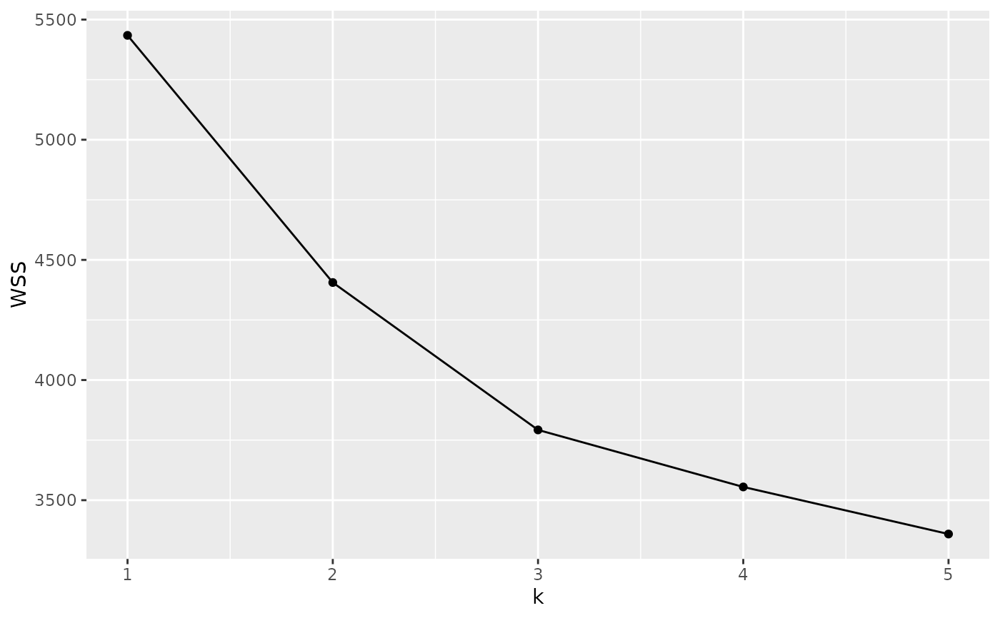
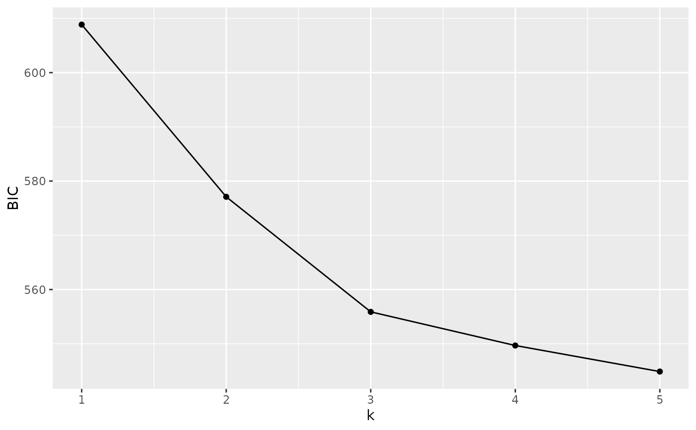
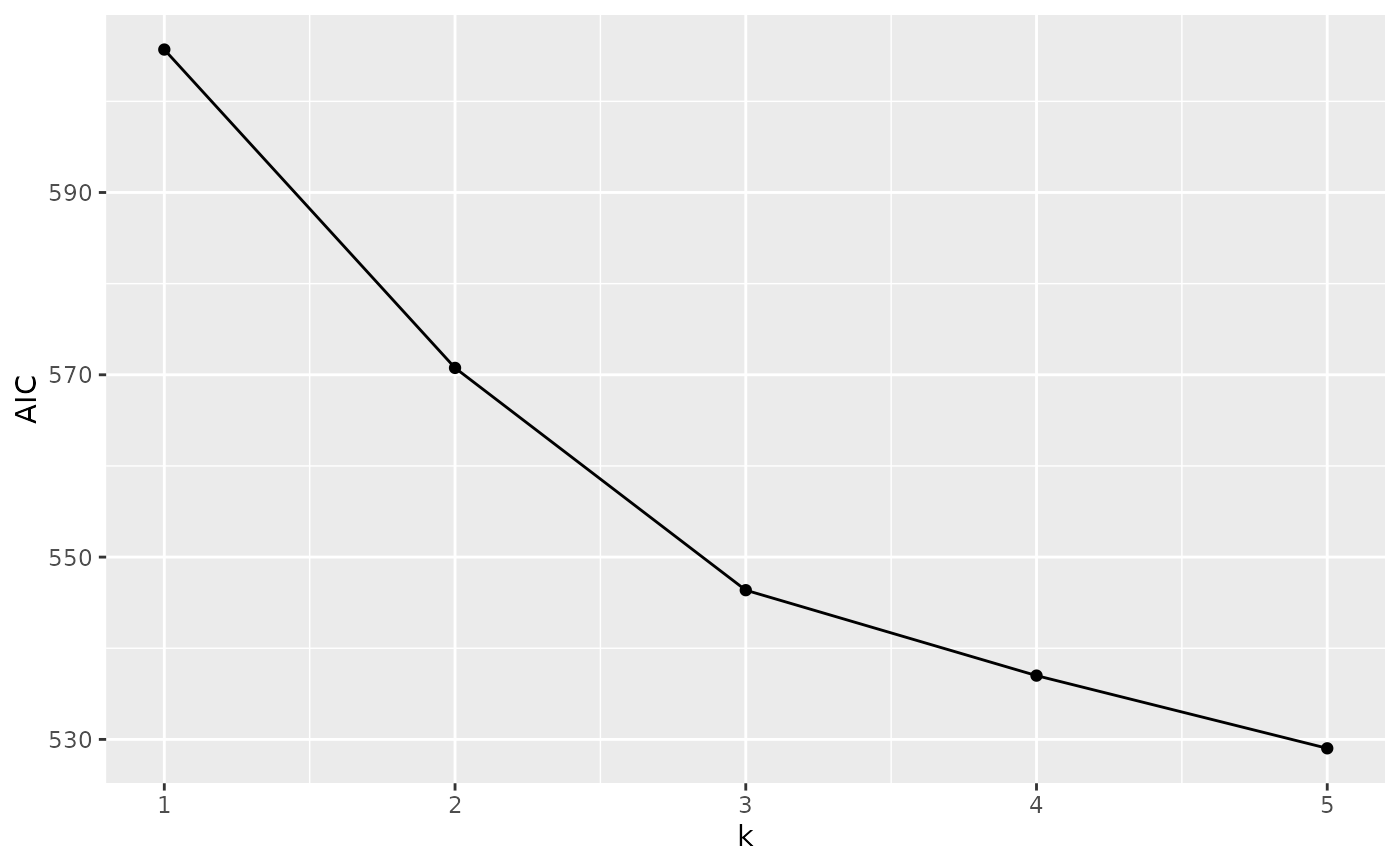
For gt_cluster_pca, autoplot produces a plot of a metric of choice
('BIC', 'AIC' or 'WSS') against the number of clusters (k). This plot is
can be used to infer the best value of k, which corresponds to the smallest
value of the metric (the minimum in an 'elbow' shaped curve). In some cases,
there is not 'elbow' and the metric keeps decreasing with increasing k; in
such cases, it is customary to choose the value of k at which the decrease
in the metric reaches as plateau. For a programmatic way of choosing
k, use gt_cluster_pca_best_k().
Details
autoplot produces simple plots to quickly inspect an object. They are not
customisable; we recommend that you use ggplot2 to produce publication
ready plots.
Examples
# Create a gen_tibble of lobster genotypes
bed_file <-
system.file("extdata", "lobster", "lobster.bed", package = "tidypopgen")
lobsters <- gen_tibble(bed_file,
backingfile = tempfile("lobsters"),
quiet = TRUE
)
# Remove monomorphic loci and impute
lobsters <- lobsters %>% select_loci_if(loci_maf(genotypes) > 0)
lobsters <- gt_impute_simple(lobsters, method = "mode")
# Create PCA object
pca <- gt_pca_partialSVD(lobsters)
# Run clustering on the first 10 PCs
cluster_pca <- gt_cluster_pca(
x = pca,
n_pca = 10,
k_clusters = c(1, 5),
method = "kmeans",
n_iter = 1e5,
n_start = 10,
quiet = FALSE
)
# Autoplot BIC
autoplot(cluster_pca, metric = "BIC")
 # # Autoplot AIC
autoplot(cluster_pca, metric = "AIC")
# # Autoplot AIC
autoplot(cluster_pca, metric = "AIC")
 # # Autoplot WSS
autoplot(cluster_pca, metric = "WSS")
# # Autoplot WSS
autoplot(cluster_pca, metric = "WSS")