tidytracks also includes a function for animating maps
of animal movement data over time.
load tracking data
First, load your data. Here we are using 10 wandering albatross tracks from Bird Island, South Georgia, each lasting approximately 1 year.
# load data from CSV file into tidytracks
df <- tt_read_data(
  events = "data/wanderer_example_tracks.csv",
  col_track_id = "bird_id",
  col_coords = c("lon", "lat"),
  col_date_time = "date_time"
)

# inspect the data
df
## A <move2> with `track_id_column` "bird_id" and `time_column` "date_time"
## Containing 10 tracks lasting on average 355 days in a
## Simple feature collection with 4506 features and 2 fields
## Geometry type: POINT
## Dimension:     XY
## Bounding box:  xmin: -179.85 ymin: -63.37 xmax: 179.55 ymax: -30.5
## Geodetic CRS:  WGS 84
## First 10 features:
##              date_time bird_id              geometry
## 1  2007-12-16 02:32:00 bird_01  POINT (-39.06 -48.8)
## 2  2007-12-16 14:37:00 bird_01 POINT (-40.37 -49.38)
## 3  2007-12-17 02:43:00 bird_01 POINT (-41.93 -49.27)
## 4  2007-12-17 14:38:00 bird_01  POINT (-40.5 -48.63)
## 5  2007-12-18 02:35:00 bird_01 POINT (-39.56 -48.34)
## 6  2007-12-18 14:26:00 bird_01 POINT (-37.25 -47.96)
## 7  2007-12-19 02:26:00 bird_01  POINT (-37.19 -46.8)
## 8  2007-12-19 14:19:00 bird_01 POINT (-35.63 -46.39)
## 9  2007-12-20 02:15:00 bird_01 POINT (-34.32 -46.17)
## 10 2007-12-20 14:14:00 bird_01 POINT (-34.13 -46.66)
## Track features:
##    bird_id
## 1  bird_01
## 2  bird_02
## 3  bird_03
## 4  bird_04
## 5  bird_05
## 6  bird_06
## 7  bird_07
## 8  bird_08
## 9  bird_09
## 10 bird_10
regularise data
Animation works best with regular time steps and, if you have multiple individuals, matching timestamps across individuals that were tracked concurrently. Therefore we regularise our timestamps if we haven’t already:
df <- tt_regular_time(
  x = df,
  interval = as_units(12, "hour"),
  snap_times = TRUE
)
df
## A <move2> with `track_id_column` "bird_id" and `time_column` "date_time"
## Containing 10 tracks lasting on average 354 days in a
## Simple feature collection with 7093 features and 2 fields
## Geometry type: POINT
## Dimension:     XY
## Bounding box:  xmin: -179.8794 ymin: -63.10255 xmax: 179.76 ymax: -30.57208
## Geodetic CRS:  WGS 84
## First 10 features:
##              date_time bird_id                    geometry
## 1  2007-12-16 12:00:00 bird_01 POINT (-40.08372 -49.25566)
## 2  2007-12-17 00:00:00 bird_01 POINT (-41.58037 -49.29652)
## 3  2007-12-17 12:00:00 bird_01 POINT (-40.81285 -48.77294)
## 4  2007-12-18 00:00:00 bird_01  POINT (-39.7623 -48.40334)
## 5  2007-12-18 12:00:00 bird_01  POINT (-37.72153 -48.0418)
## 6  2007-12-19 00:00:00 bird_01 POINT (-37.20196 -47.03522)
## 7  2007-12-19 12:00:00 bird_01 POINT (-35.93227 -46.47159)
## 8  2007-12-20 00:00:00 bird_01 POINT (-34.56619 -46.21262)
## 9  2007-12-20 12:00:00 bird_01  POINT (-34.16567 -46.5687)
## 10 2007-12-21 00:00:00 bird_01 POINT (-33.05775 -46.98074)
## Track features:
##    bird_id
## 1  bird_01
## 2  bird_02
## 3  bird_03
## 4  bird_04
## 5  bird_05
## 6  bird_06
## 7  bird_07
## 8  bird_08
## 9  bird_09
## 10 bird_10
examples 1 & 2: map with polygons
NB. We use a subset (first 30 days) of the dataset for these maps to keep the file size of the animations low.
load layers
Read in any other layers you want to include in your map, e.g.
- raster file such as bathymetry to use as a basemap
- polygons e.g. countries, national park boundaries
- points e.g. colony or tagging location
# make colony dataframe, make it spatial and add CRS using sf package
colony <- data.frame(colony = "Bird Island", lon = -38.03, lat = -54) %>%
  st_as_sf(coords = c("lon", "lat")) %>%
  st_set_crs(4326)

# read countries from rnaturalearth at medium res
library(rnaturalearth)
land <- ne_countries(scale = "medium", returnclass = "sf")
subset data to test
We’re going to test out our maps and animations on the first 30 days of the data.
make map
Next, assemble your map using ggplot2. Add
sf layers using geom_sf, terra
layers using tidyterra’s functions
geom_spatraster (for rasters) or
geom_spatvector (for vectors), and add your
tidytracks layer using geom_event_path for
paths or geom_event_point for points.
# make the map
map <- ggplot() +
  geom_event_path(
    data = df_sub, aes(col = bird_id), # tracks layer
    size = 1.5, lineend = "round"
  ) + # rounded line ends look smoother
  geom_sf(data = land, fill = "grey50", col = NA) + # land polygons
  geom_sf(data = colony, pch = 24, fill = "yellow") # add colony layer
# print the map
map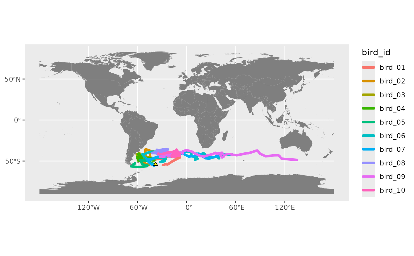
projection and limits
Use ggplot2 functions coord_cartesian or
coord_sf to change the limits of the plot (alternatively,
you can crop all your layers to the required area before making the
plot). coord_sf can also change the projection.
# define south polar LAEA projection for plotting
my_crs <- paste0(
  "+proj=laea +lat_0=-90 +lon_0=0 +x_0=0 +y_0=0 ",
  "+datum=WGS84 +units=m +no_defs"
)

# you can use st_coordinates to get min/max coordinates of your tracking data
range(st_coordinates(df)[, "X"])
## [1] -179.8794  179.7600
range(st_coordinates(df)[, "Y"])
## [1] -63.10255 -30.57208

# update extent of map using extent of tracking data
map <- map +
  coord_sf(
    crs = my_crs, # change projection to LAEA South Polar
    # NB. lims must be in the units of the target CRS, so we need to
    # transform the data to that crs using st_transform
    xlim = range(st_coordinates(st_transform(df_sub, my_crs))[, "X"]),
    ylim = range(st_coordinates(st_transform(df_sub, my_crs))[, "Y"])
  )
map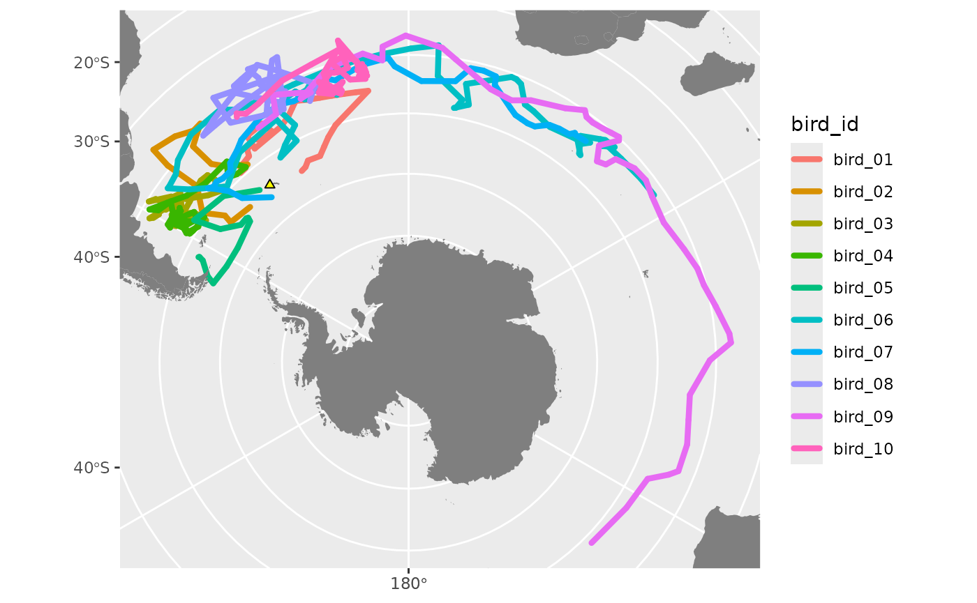
animate map
Animate the map using animate_map(). This produces a
gganim object (a ggplot2 object with extra
animation logic). We will use the animate function from the
gganimate package to render the animation from this
object.
Our gganim object has an attribute called
n_timesteps. This is the number of unique timestamps in the
tracking data used to make the plot. To ensure a smooth animation, we
need to render it with at least as many frames as there are time
steps in the tracking data.
map_anim <- animate_map(
  p = map, # our ggplot map
  wake_length = 0.3, # proportion of total animation time
  label_format = "%B %d" # month and date
)

class(map_anim) # the gganim object
## [1] "gganim"          "ggplot2::ggplot" "ggplot"          "ggplot2::gg"
## [5] "S7_object"       "gg"
attr(map_anim, "n_timesteps") # number of time steps in animation
## [1] 60
render animation
Now, we render the animation using gganimate::animate().
By default, gganimate uses 100 frames. We will change this
using the nframes parameter.
You can specify the length of your animation using two out of these three parameters:
-
nframes: number of frames to render (default 100) -
fps: framerate in frames/second (default 10) -
duration: duration of the animation in seconds (no default)
Here we use the suggested number of frames, and a duration of 20 seconds. Depending on the number of frames, rendering take a few minutes or longer.
See the gganimate documentation for more information on the different renderer options for making your animation. You can also save each frame as an image file and use your own software to bind them into a video.
gganimate::animate(
  plot = map_anim, # our ggplot with added animation
  # Number of frames equals time steps in the data.
  nframes = attr(map_anim, "n_timesteps"),
  duration = 5, # video duration in seconds
  renderer = av_renderer(), # default is gifski_renderer()
  # optionally, specify width and height of output animation
  width = 540, height = 400,
  units = "px", res = 96 # w/h in pixels, res in dpi
)
To save the animation to file, use gganimate’s
anim_save() function which by default saves the most recent
animation, similarly to ggsave().
anim_save("example_animation.webm") # add appropriate file extensionpoints vs paths
This animation included the tracking data as paths using
geom_event_path(). Let’s illustrate the difference between
paths and points by re-creating it using
geom_event_point().
# first, make the map and print it to check
map <- ggplot() +
  geom_event_point(data = df_sub, aes(col = bird_id), size = 3) + # tracks layer
  geom_sf(data = land, fill = "grey50", col = NA) + # land polygons
  geom_sf(data = colony, pch = 24, fill = "yellow") + # add colony layer
  coord_sf(
    crs = my_crs, # change projection and define limits
    xlim = range(st_coordinates(st_transform(df_sub, my_crs))[, "X"]),
    ylim = range(st_coordinates(st_transform(df_sub, my_crs))[, "Y"])
  )
# print to check
map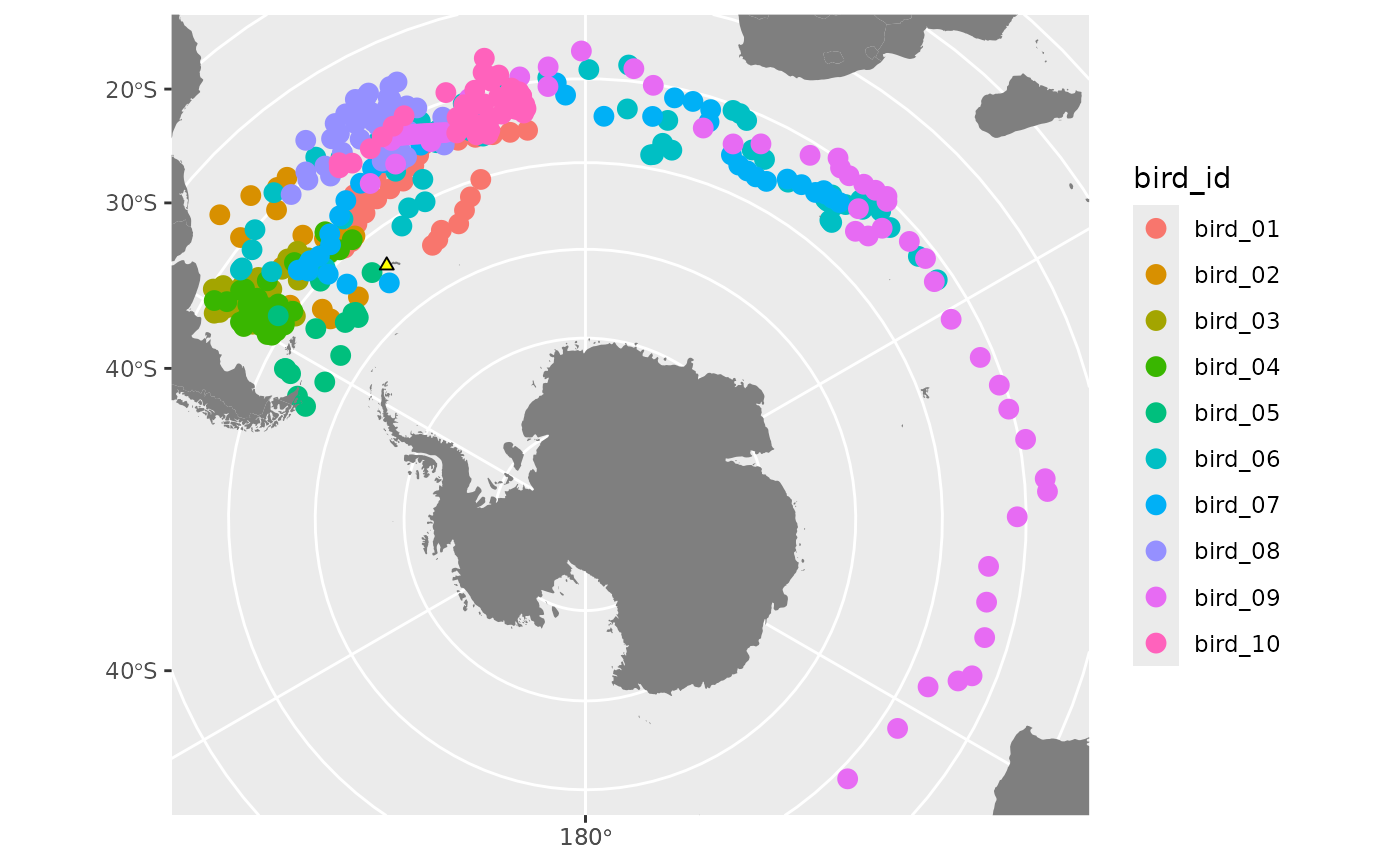
# add animation
map_anim2 <- animate_map(
  p = map,
  wake_length = 0.3,
  label_format = "%B %d"
)
# render the animation
gganimate::animate(
  plot = map_anim2,
  nframes = attr(map_anim2, "n_timesteps"),
  duration = 5,
  renderer = av_renderer(),
  # optionally, specify width and height of output animation
  width = 540, height = 400,
  units = "px", res = 96
)
Points animations work best when the resolution of the tracking data is high, so points are closer together.
example 3: map with raster
In this example we’re going to add a basemap as a
spatRaster object using the package terra.
We’ll download a raster using the basemaps package, but you
can also load in your own raster (for example, from a
geotiff or netCDF file) using
terra::rast() and add it to the map using
tidyterra::geom_spatraster.
# load packages for acquiring, loading, and plotting rasters
library(basemaps)
library(terra)
library(tidyterra)
get basemap
To download using basemaps, you need to ask for a
defined spatial extent (in longitude/latitude) - usually we want the
bounding box of our data so we can define the extent programmatically,
but sometimes you may want to define it manually, or add a buffer around
your data.
# option 1: make a rectangle as the bounding box of all the data (in lon/lat)
rect <- st_as_sfc(st_bbox(df))

# option 2: specify the rectangle manually. I want the whole Southern Ocean
# and up to the northern extent of my data (plus a 15 degree buffer)
rect_coords <- c(
  xmin = -180, # define the corners
  xmax = 180,
  ymin = -90,
  ymax = max(st_coordinates(df)[, "Y"]) + 15
) # add buffer
# convert to an sfc object and set the CRS
rect <- st_as_sfc(st_bbox(rect_coords)) %>%
  st_set_crs(4326)
rect
## Geometry set for 1 feature
## Geometry type: POLYGON
## Dimension:     XY
## Bounding box:  xmin: -180 ymin: -90 xmax: 180 ymax: -15.57208
## Geodetic CRS:  WGS 84
## POLYGON ((-180 -90, 180 -90, 180 -15.57208, -18...
Now we have the extent rect, let’s download the
basemap.
# download basemap as a terra spatRaster
bmap <- basemap_terra(rect, map_service = "esri", map_type = "world_ocean_base")
## Loading basemap 'world_ocean_base' from map service 'esri'...
make map
Now assemble our map. We can add the raster layer using the
tidyterra functions geom_spatraster (for
single layer e.g. bathymetry raster) or geom_spatraster_rgb
(for RGB rasters with a layer for each of red, green, blue).
# define new track colours to show up better on a blue background
track_colours <- c(
  "#FFD700", # Gold
  "#FF6B35", # Orange
  "#FF3399", # Hot pink
  "#39FF14", # Neon green
  "#FF4444", # Red
  "#00FFCC", # Aqua
  "#CC44FF", # Purple
  "#FFFEE4", # White ish
  "#FF7070", # Coral
  "#CFFF04" # Neon yellow
)

# assemble map
map <- ggplot() +
  geom_spatraster_rgb(data = bmap) + # basemap
  geom_event_path(
    data = df, aes(col = bird_id), size = 2, # tracks
    lineend = "round"
  ) +
  scale_colour_manual(values = track_colours) + # track colours
  geom_sf(data = colony, pch = 24, fill = "yellow") + # colony
  coord_sf(crs = my_crs) # projection

# remove axes and gridlines so it looks neater
map <- map +
  theme_void() +
  theme(
    plot.background = element_rect(
      fill = "white",
      colour = "white"
    )
  )
map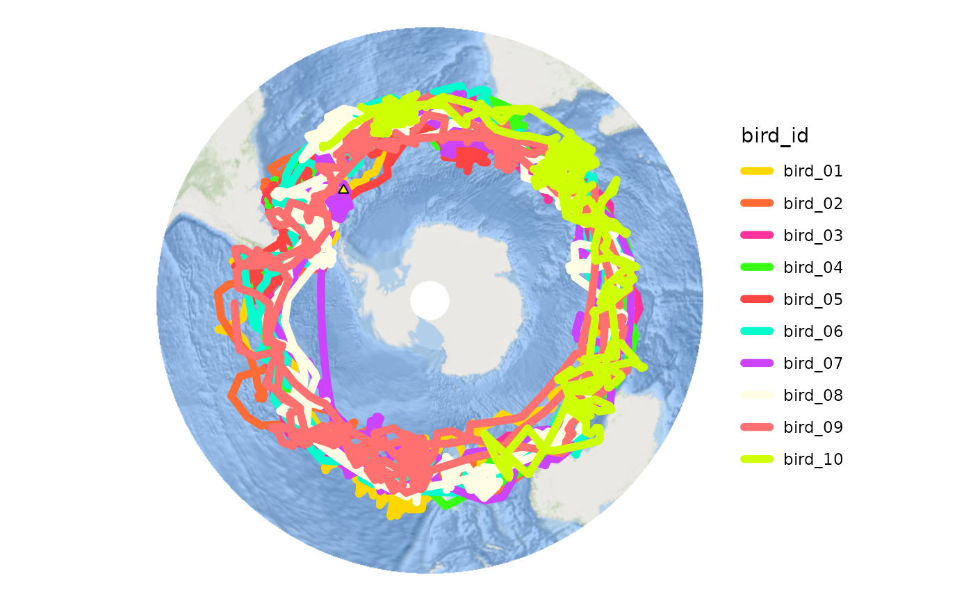
animate
Now add the animation logic to the map and render the animation with the suggested number of frames.
This time we’ll add the animation by piping the ggplot
to animate_map - both ways of using the function work.
# add animation to the map, this time with pipe
map_anim <- map %>%
  animate_map(
    wake_length = 0.1,
    label_format = "%B %Y"
  )

# render the animation
gganimate::animate(
  plot = map_anim,
  nframes = attr(map_anim, "n_timesteps"),
  duration = 20,
  renderer = av_renderer(),
  # optionally, specify width and height of output animation
  width = 568, height = 500,
  units = "px", res = 96
)