Interpolating genetic data
2025-10-10
Source:vignettes/articles/interpolating.Rmd
interpolating.RmdIn this vignette, we will demonstrate how to interpolate principal
component scores across geographic space using the tidypopgen
integration with the sf package.
To do so, we will use a dataset of Anolis punctatus lizards
from South America, introduced in the vignette ‘Population genetic
analysis with tidypopgen’. For a full analysis of this dataset using
tidypopgen, and details on how to download the data, please
refer to this previous vignette.
Let’s begin by reading in the data and attaching the metadata:
library(tidypopgen)
vcf_path <-
  system.file("/extdata/anolis/punctatus_t70_s10_n46_filtered.recode.vcf.gz",
    package = "tidypopgen"
  )
anole_gt <-
  gen_tibble(vcf_path, quiet = TRUE, backingfile = tempfile("anolis_"))

pops_path <- system.file("/extdata/anolis/punctatus_n46_meta.csv",
  package = "tidypopgen"
)
pops <- read.csv(pops_path)
anole_gt <- anole_gt %>% left_join(pops, by = "id")
And we can check our data using:
anole_gt %>% glimpse()
#> Rows: 46
#> Columns: 6
#> A tibble: 46 × 6
#> $ id         <chr> "punc_BM288", "punc_GN71", "punc_H1907", "punc_H1911", "punc_H2546", "punc_IBSPCRIB036…
#> $ genotypes  <vctr_SNP> [0,0,...], [2,0,...], [0,2,...], [0,2,...], [0,1,...], [0,0,...], [0,0,...], [0,0…
#> $ population <chr> "Amazonian_Forest", "Amazonian_Forest", "Amazonian_Forest", "Amazonian_Forest", "Amazo…
#> $ longitude  <dbl> -51.8448, -54.6064, -64.8247, -64.8203, -65.3576, -46.0247, -36.2838, -40.5219, -40.52…
#> $ latitude   <dbl> -3.3228, -9.7307, -9.4459, -9.4358, -9.5979, -23.7564, -9.8092, -20.2811, -19.9600, -1…
#> $ pop        <chr> "Eam", "Eam", "Wam", "Wam", "Wam", "AF", "AF", "AF", "AF", "AF", "Wam", "Wam", "Eam", …
Map
tidypopgen integrates with the sf package
to allow swift and easy spatial analyses and mapping of genetic data. To
begin, we can add sf geometry to our
gen_tibble using gt_add_sf(). We need to
specify the names of the columns containing the longitude and latitude
coordinates.
anole_gt <- gt_add_sf(anole_gt, c("longitude", "latitude"))
anole_gt
#> Simple feature collection with 46 features and 6 fields
#> Geometry type: POINT
#> Dimension:     XY
#> Bounding box:  xmin: -75.8069 ymin: -23.7564 xmax: -35.7099 ymax: 4.4621
#> Geodetic CRS:  WGS 84
#> # A gen_tibble: 3249 loci
#> # A tibble:     46 × 7
#>    id                 genotypes population       longitude latitude pop              geometry
#>    <chr>             <vctr_SNP> <chr>                <dbl>    <dbl> <chr>         <POINT [°]>
#>  1 punc_BM288         [0,0,...] Amazonian_Forest     -51.8    -3.32 Eam    (-51.8448 -3.3228)
#>  2 punc_GN71          [2,0,...] Amazonian_Forest     -54.6    -9.73 Eam    (-54.6064 -9.7307)
#>  3 punc_H1907         [0,2,...] Amazonian_Forest     -64.8    -9.45 Wam    (-64.8247 -9.4459)
#>  4 punc_H1911         [0,2,...] Amazonian_Forest     -64.8    -9.44 Wam    (-64.8203 -9.4358)
#>  5 punc_H2546         [0,1,...] Amazonian_Forest     -65.4    -9.60 Wam    (-65.3576 -9.5979)
#>  6 punc_IBSPCRIB0361  [0,0,...] Atlantic_Forest      -46.0   -23.8  AF    (-46.0247 -23.7564)
#>  7 punc_ICST764       [0,0,...] Atlantic_Forest      -36.3    -9.81 AF     (-36.2838 -9.8092)
#>  8 punc_JFT459        [0,0,...] Atlantic_Forest      -40.5   -20.3  AF    (-40.5219 -20.2811)
#>  9 punc_JFT773        [0,0,...] Atlantic_Forest      -40.5   -20.0  AF        (-40.52 -19.96)
#> 10 punc_LG1299        [0,0,...] Atlantic_Forest      -39.1   -15.3  AF    (-39.0694 -15.2696)
#> # ℹ 36 more rows
We can then create a map of South America using the
rnaturalearth package. This will be the base map onto which
we will plot our samples and interpolate our PC scores.
library(rnaturalearth)
library(ggplot2)

map <- ne_countries(
  continent = "South America",
  type = "map_units", scale = "medium"
)

ggplot() +
  geom_sf(data = map) +
  geom_sf(data = anole_gt$geometry, aes(colour = anole_gt$population)) +
  coord_sf(
    xlim = c(-85, -30),
    ylim = c(-30, 15)
  ) +
  theme_minimal() +
  guides(colour = guide_legend(title = "Population"))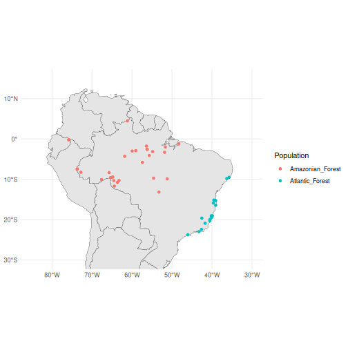
PCA
Our previous vignette used PCA, DAPC, and ADMIXTURE to show that this sample of Anolis punctatus lizards contains three main genetic clusters across the range of the species. Suppose that we wanted to interpolate the first principal component across the range of the species to observe the change in genetic variation across space.
Let’s run a PCA and augment the gen_tibble with the principal component scores.
anole_gt <- gt_impute_simple(anole_gt, method = "mode")
anole_pca <- anole_gt %>% gt_pca_partialSVD(k = 30)
anole_gt <- augment(anole_pca, data = anole_gt)
Interpolating
Now that we have a map and our genetic data with PCA scores, we can interpolate the scores of the first principal component across the landscape.
To begin with, we will need to load the sf,
terra, and tidyterra packages.
We will first prepare the map by unifying all geometries into a single polygon and casting it to “POLYGON” type.
The, we need to create a grid of points covering the area of the map.
grid <- rast(map, nrows = 100, ncols = 100)
xy <- xyFromCell(grid, 1:ncell(grid))
By converting this grid to an sf object, we can then use
st_filter() to keep only the points that fall within the
landmass.
coop <- st_as_sf(as.data.frame(xy), coords = c("x", "y"),
                 crs = st_crs(map))
coop <- st_filter(coop, map)
Now we can use the gstat package to perform spatial
interpolation of heterozygosity.
gstat implements several methods for spatial
interpolation, including inverse distance weighting (IDW) and kriging.
Here, we will use IDW to interpolate heterozygosity across our grid of
points.
We remove the genotypes from our gen_tibble, as
gstat does not accept a gen_tibble object, and
then run the interpolation:
anole_sf_obj <- anole_gt %>% select(-"genotypes")

library(gstat)
res <- gstat(formula = .fittedPC1 ~ 1, locations = anole_sf_obj,
             nmax = nrow(anole_sf_obj),
             set = list(idp = 1))

resp <- predict(res, coop)
#> [inverse distance weighted interpolation]
resp$x <- st_coordinates(resp)[,1]
resp$y <- st_coordinates(resp)[,2]
We can rasterize the interpolated values:
pred <- rasterize(resp, grid, field = "var1.pred", fun = "mean")And for a publication-ready figure, we can use ggplot2
and the tidyterra package to plot:
ggplot()  +
  geom_sf(data = map, fill = "grey95")  +
  geom_spatraster(data = pred, aes(fill = mean))+
  geom_sf(data = anole_gt$geometry, aes(fill = anole_gt$.fittedPC1),
          shape = 21, colour = "black", size = 2, stroke = 0.3) +
  coord_sf(
    xlim = c(-85, -30),
    ylim = c(-30, 15)
  ) +
  scale_fill_viridis_c(name = "Interpolated PC1", alpha= 0.8, na.value = NA) +
  scale_color_viridis_c(name = "Observed", alpha= 0.8) +
  theme_minimal()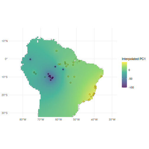
From our interpolated map, we can see the clear gradient in the first principal component scores across the range of Anolis punctatus, with the highest scores among Atlantic forest populations in the east, and the lowest scores clustered among Amazonian populations in the west.